Following on from Ben’s excellent SENT decoding post here viewtopic.php?p=99866#p99866 the thought crossed my mind about adding the graphed Excel data back into PicoScope; but why?
At present, whilst you can save your psdata file in csv format, this does not include math channels or reference waveforms, only active channels!
Given you can export serial decoded data and psdata files in csv format, you can graph and blend all this data into a single graph view within Excel. However, what if you need to include a math channel or reference waveform?
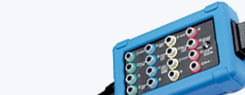
Below is an example where we have 2 essential math channels included in our psdata file (Engine RPM and MAF Frequency) along with serial decoded data from a SENT MAP and APP sensor
Image 4
To be able to view all these waveforms in a single PicoScope graph view would be the ultimate goal
Thanks to Microsoft Excel, PowerPoint, Paint, and Photos we can do just this, however it does take time!
Referring once again to Ben’s forum post here viewtopic.php?p=99866#p99866 we graph both the MAP & App signals (Ch 1 Column E) within our exported SENT decode table using Excel (I.e., open the exported SENT csv file using Excel)
Image 1
Above we have the APP signal graphed in our Excel spreadsheet. Note at this stage we are not concerned about true units and values, (APP %) only the rate of change of our signal which is relevant for this topic. I.e., I just need to plot where in our buffer the gas pedal was pressed to the floor and then released.
Using column C “Start Time” we can find the precise time in our buffer where the gas pedal moved from the rest position (value 307) and began to increase (so denoting gas pedal activation)
Image 2
Above we can see the gas pedal rest value of 307 starts to increase at a “Start Time” of 0.8742 seconds into our buffer. Note, the time references in the decode table are also relevant to the time span of our X axis within PicoScope. This time value of 0.8742 seconds can be identified and “marked” using a single time ruler. Likewise below, using “Start Time” we can identify and mark the return to the rest position of the gas pedal at 6.8767 seconds
Image 3
Note above how the line graph has now been stripped of the axes, title and gridlines leaving only the APP graph. (Click on the graph view to delete these items) I have also changed the colour of the line graph to represent the channel colour of channel F of our PicoScope (Grey)
Right click inside the line graph and select Ctrl+C to copy just the plot area of the line graph
Image 3B
Now open the Windows “PowerPoint” App, open a “Blank Presentation” add a blank slide followed by Ctrl+V where the plot area of your line graph will be copied to the PowerPoint App. Now right click the graph image and select “Save as Picture” (Use .JPEG format) choose a file name and location to save the image. This step is required to ensure good image resolution within our final image containing all relevant waveforms
Image 3C
Below we have our psdata file of interest displaying one active channel, 2 math channels, 2 SENT Fast decode tables for channels D (APP) & F (MAP) along with our time rulers placed as markers at 0.8742 and 6.8767 seconds to denote where the gas pedal was initially activated and where it returned to the rest position.
Image 4
At this stage we need to take a screen shot of the above psdata file in “Full Screen Mode” and save the image as a .png file. Click on the “Full” button within PicoScope to enable full screen viewing mode. Press the PrtScn key on your keyboard followed by Ctrl+C (This will copy the image on screen) Open the Windows “Paint” App followed by Ctrl+V where your screen shot will be copied to the Paint App. Amend the zoom feature in Paint to allow for full viewing of the entire image and resize using the hand tool below to ensure no white space is visible around the perimeter of the image (only the graph view of PicoScope should be visible) Note below our image size is now 1928 x 1088
Image 5
With our image resized and all white space removed, we need to determine the size of the plot area within the image of our PicoScope graph view.
Click inside the image starting at the top left-hand corner and drag the “formed box” (blue dotted rectangle) to the bottom right-hand corner so as to align perfectly with the plot area of PicoScope
Note the size of the plot area in our example below is 1814 x 1052 (This value is required for later)
It is important at this stage not to crop the image to this size, once you have the size of the plot area, just click outside the image to remove the blue dotted rectangle (crop area)
Image 5 B
Now select File > Save As > PNG Picture > Choose a file name and location to save the image
To recap at this stage, we have saved 2 images one full screen of PicoScope (.PNG) and 1 line graph (.JPEG) of our APP sensor
We now need to return to Excel and graph the SENT MAP signal (Ch 1 Column E) within our exported SENT decode table
Image 6
Above we have the graph of our MAP sensor signal which we need to time correlate to the application of the gas pedal and our channels displayed within the PicoScope graph view, but how?
Remember how we used the SENT message “Start Time” of the gas pedal moving from and returning to rest as a marker within PicoScope? Well, we can do something very similar by manipulating data within Channel 1 (Column E) in the form of adding a fabricated value at near identical Start Times (see below)
Image 7 A
Above we have changed the cell value of Channel 1 data (with a Start Time of 0.8773) from 1060 to a random value of 500 so as to introduce a marker into our Excel line graph. Note we have also removed all the axes, labels, gridlines and changed the colour of the graph to match channel D of PicoScope
Below we have added another fabricated value of 500 to the cell value of Channel 1 data (with a Start Time of 6.8760 seconds) to provide the final marker within our MAP signal
Image 8
Right click inside the line graph and select Ctrl+C to copy just the plot area of the line graph
Following the exact procedure we used earlier, (when saving our APP signal) return to Windows “PowerPoint” App, add a blank slide followed by Ctrl+V where the plot area of your line graph will be copied to the PowerPoint App. Now right click the graph image and select “Save as Picture” (Use .JPEG format) choose a file name and location to save the image.
Open your saved APP or MAP .JPEG file using “Photos” (often the default App for images with Windows) and click on the “Crop” tool
Image 9
Using the white “handles” at the bottom left and right of the line graph, drag the cropping tool rectangle so as to remove all the space between the image border and the line graph (See blue circles below) Do not crop any of the line graph.
Image 10
Click on “Save a copy” then click the 3 horizontal dots followed by “Resize”
Image 11
Click on “Define custom dimensions”, deselect “Maintain aspect ratio” and enter the dimensions of the PicoScope plot area we discovered earlier 1814 x 1052 followed by “Save resized copy”
Image 12
Repeat the above process for the MAP sensor signal so you now have 2 x cropped images containing only the line graphs, both of which are resized to 1814 x 1052
Return now to “Paint” and open the saved .PNG file of the full screen view of our PicoScope capture, select “Paste” and “Paste from”
Image 13
Locate and select either of the saved cropped and resized .JPEG APP or MAP files, this will place either of these files on top of the PicoScope capture. Now click on the “Select” option and tick the box adjacent to “Transparent selection” This will leave just the line graph of your chosen sensor on top of the PicoScope graph view
Image14
Drag the APP sensor image about the PicoScope graph view so as to align the precise point the gas pedal moves from rest at 874.2 ms and returns to rest at 6.877 s (denoted by our time rulers) and save your image
Image 15
Repeat the above process for your remaining sensor, below we have MAP
Image 16
As you can see above, we can now graph the two sensors utilizing SENT (APP & MAP) against math channels and active channels alike. Of course, the pitfalls of carrying out this procedure such as sizing, cropping and aligning all lend themselves to precious time consumption but the final outcome does provide an indication of correlation between previously uncorrelatable channels (i.e., maths and reference waveforms)
The videos below will help with the description above:
That is a very interesting guide and it seems it is the only way that you can corrolate signals from encoded sensors such as SENT against traditional analogue and PWM signals to make sense of a cars behaviour. I can see how much work you have put into making this possible using the various Microsoft programs as a workaround, but as you mentioned, this much work in the real world when fixing a car against time constraints and the challenges of a workshop environment are just not practical.
I'm sure the software genius' at Pico could write a program to automate this process, even if it meant a program that worked separate to PS7 to import the saved data files and visualise the results for analysis, instead of within PS7 and risk overloading the CPU and RAM on the laptop? Not that the software dept haven't got enough on already!
Thank you for the feedback James, it was just what the doctor ordered
Rest assured your comments will reach all the relevant team members and I hope we see something like what you describe after we reach parity between PS6 and PS7
Can you imagine; graphing serial data within PicoScope? (Said too much already!)